"Design" window Introduction
"Design" window is the core part of the entire software, where most operations are performed.
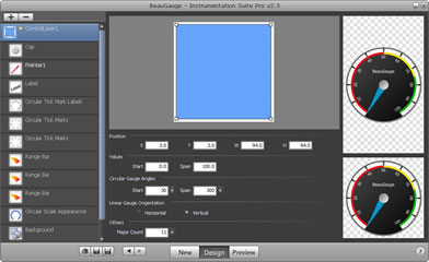
"Design" window is divided into four parts:
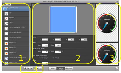
1. Component List
2. Property Page
3. Preview
4. Toolbar
1. Component List
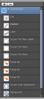
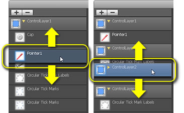
The listed components are shown overlapped from top to bottom when the control is running.
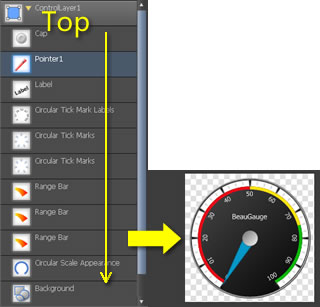
Drag the components up and down in the list and their final display effects will be changed, those at the top of the list also displaying top of the control.
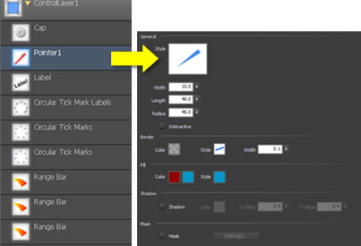
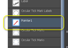
To change the appearance of a component, please first select it from the list and then implement it in the property page.
The following 3 buttons correspond Add, Copy, Delete a component.
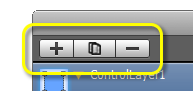
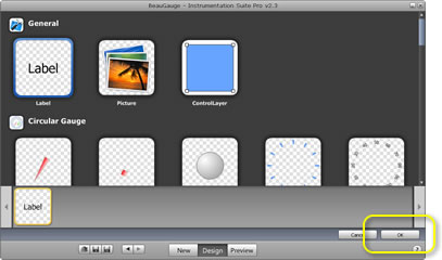
After click "+" button, the following component adding window will appear, select the relative component and click "OK" to add it to the list.
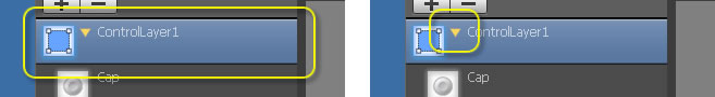
"ControlLayer" is a special component. It is a combo component; the change of its property will lead to that of all of its subcomponents. Double click "ControlLayer" or click the yellow triangle icon and ControlLayer's subcomponents will be folded.
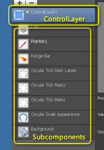
When running, components that can dynamically change such as pointer and button display bright white in the left list of the designer. The components are named by the Key value that they are moved to.
Eg:m_gauge1.SetValue(_T("Pointer1"),50); move the pointer to the location of Value 50.
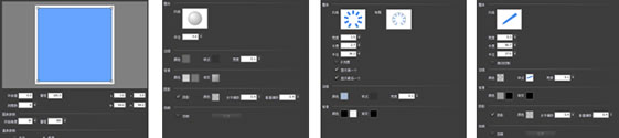
2. Property Page
Every component has different property pages. You can configure specific parameters of the component here.
Learn More
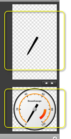
3. Preview
The upper part is the preview of the selected components in the list, while the lower is the overview preview of the control.
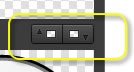
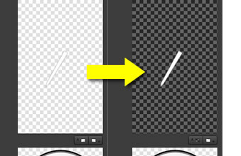
Here 2 buttons in the middle are used to switch background between dark and light for preview.
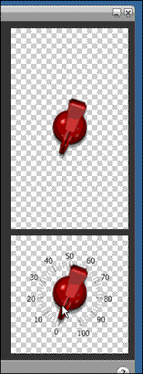
Components which can interact with the mouse can be checked for their effects in the preview area at any time.
4. Toolbar
After the design, you can save the completed control template as a file for the ActiveX control to load.