"Circular Gauge Pointer" Property Page
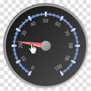
"Circular Gauge Pointer" in the left "Design" interface is shown as below, click this icon and enter its property page.
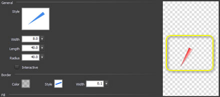
The following is the "Circular Gauge Pointer" property page. We'll explain every property one by one.
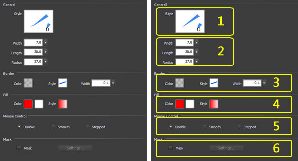
1. Style
2.
Width,Length,Radius
3.
Border
4.
Fill
5. Mouse Control
6. Mask
-
1 Style
-
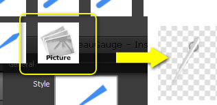
Select the pointer style in "Style" accordingly. If selecting "Picture", we can use image files for the pointer style.
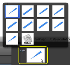
Preview it in the right zone.
Select “Picture” and use a custom image as the pointer.
-
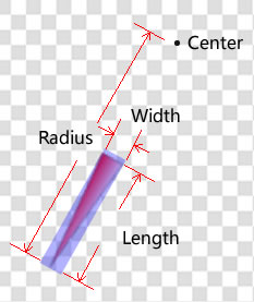
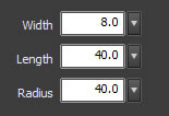
2 Width, Length, Radius - The pointer size and position are controlled by three parameters.
-
3 Border
- "Border" is the external outline of the pointer.
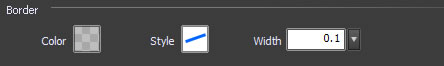

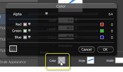
Border color.
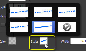
Border style
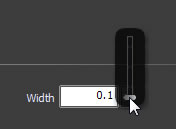
As to the width, the slider's value range is 0.1 ~ 2.0. This is the common range, if it still couldn't meet with your needs, please input your desired value in the textbox.
-
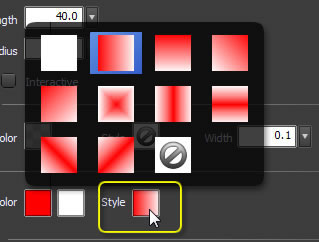
4 Fill - "Fill" is internal padding of the pointer.
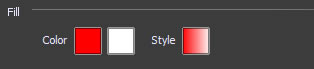

Fill style.
-
5 Mouse control
- Mouse Control Options.
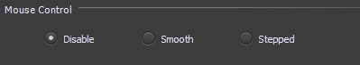
- Disable: Pointer cannot be dragged by mouse.
- Smooth: Pointer rotates smoothly in dragging. After the pointer rotated, ValueChange event will signal and notify the program.
- Stepped: The gauge pointer can only rotate to the scale in dragging, cannot stop at the area between 2 adjacent scales. After the pointer rotated, ValueChange event will signal and notify the program.
-
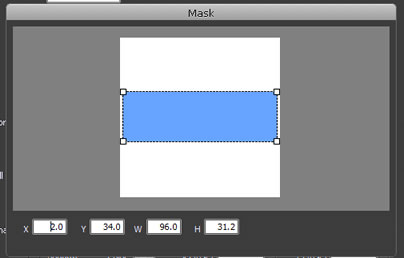
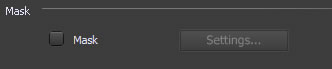
6 Mask
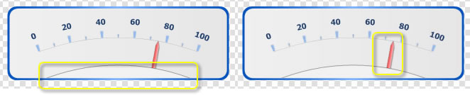
- Mask is used to hide part of the pointer.
For example, if we don't want part of the pointer and cap to display, we can use the “Mask” option, see the figure below.
Mask configuration dialog.